Rich Card Message Template
A Rich Card is a single interactive message card that combines media, text, and action buttons in one structured format. It allows businesses to send visually engaging messages to users through the RCS channel.
Rich cards are commonly used for promotions, product highlights, service updates, and announcements, where a single focused message needs to be delivered with clear actions.
Card orientation: Vertical
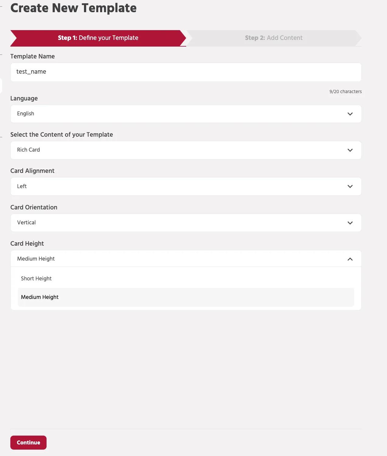
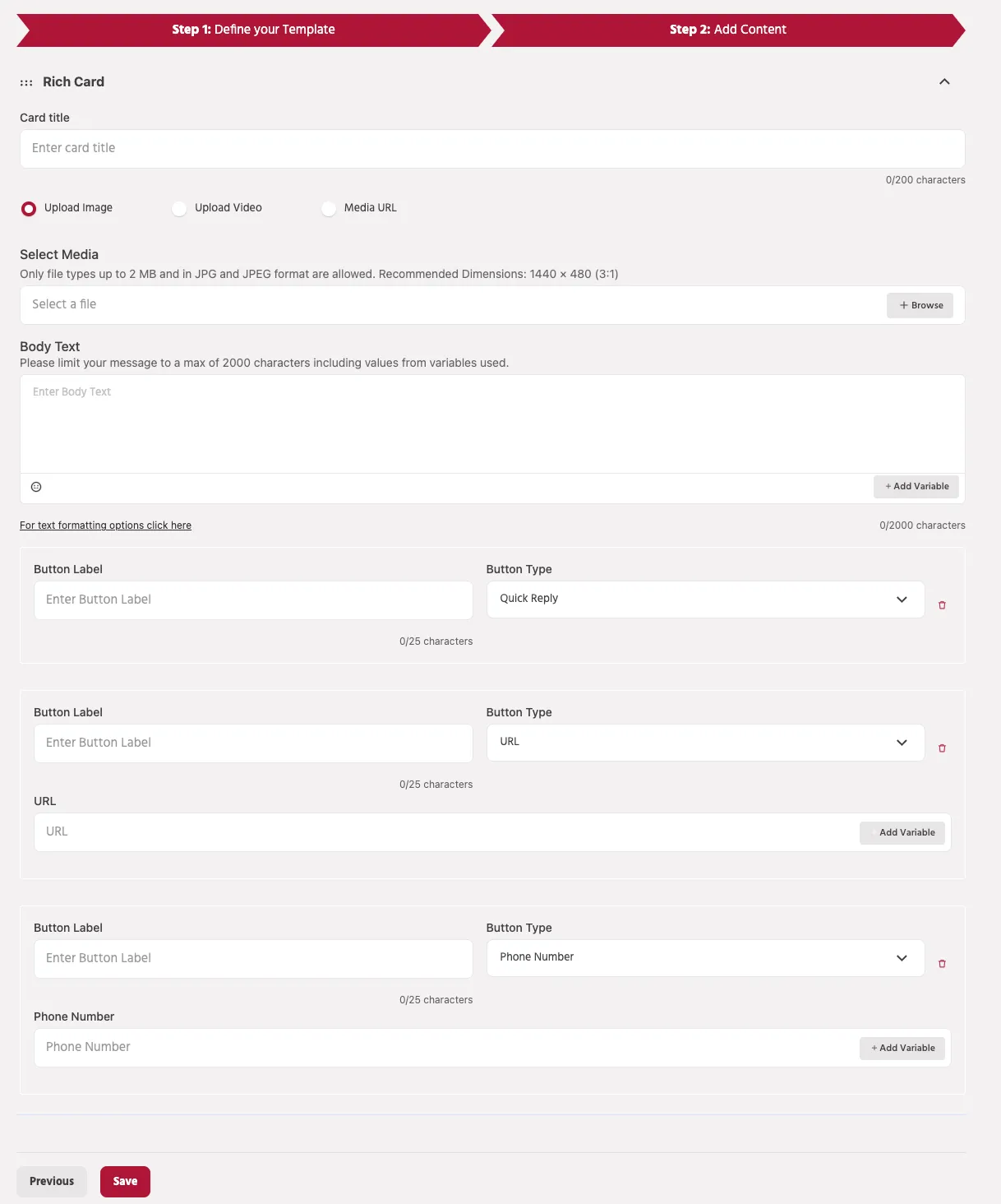
Components of a Vertical Rich Card
A Rich Card is a structured message format used in RCS that combines media, text, and interactive buttons within a single card. This format enables businesses to deliver visually engaging messages while allowing users to interact directly with the content.
A Rich Card typically includes the following components:
Card Title
The Card Title is the main heading displayed at the top of the card. It briefly describes the message content and helps users quickly understand the purpose of the message.
Example:
"Check out our latest offers!"
Media
You can attach visual media to make the message more engaging. Supported media options include:
- Image Upload – Upload an image directly from your device.
- Video Upload – Upload a video to enhance the visual presentation.
- Media URL – Provide a hosted media link if the media is stored externally.
Media improves user engagement and provides visual context for the message.
Media Requirements (Vertical Card )
When adding media to a Rich Card, ensure the following requirements are met:
Image Requirements
- Supported formats: JPG / JPEG
- Maximum file size: 2 MB
- Recommended dimensions: 1440 × 720 px (2:1 aspect ratio)
Using the recommended dimensions ensures the card displays properly across supported RCS devices.
Video Requirements
- Supported format: MP4
- Maximum file size after processing: 10 MB
If uploading a video, a thumbnail image may also be required to display a preview of the video.
Media URL Requirements
When using a media URL instead of uploading files:
- The URL must be publicly accessible.
- The link must point directly to the media file, not to a webpage.
- File size limits remain the same as uploaded media.
Example:
Body Text
The Body Text section contains the main message content. It can include additional details such as product descriptions, offers, instructions, or announcements.
You can also insert variables to personalize messages for users.
Example:
Variables allow dynamic values to be inserted when the message is delivered to the user.
Body Text Limits
- Maximum character limit: 2000 characters
- Character count includes values inserted through variables.
Buttons
Buttons allow users to interact with the message and perform actions directly from the card.
Supported button types include:
Quick Reply
Sends a predefined response back to the bot and continues the conversation in the configured bot flow.
URL Button
Opens an external webpage when the user clicks the button.
Phone Number Button
Allows users to directly call a specified phone number.
Buttons help guide users toward the next action, such as visiting a website, contacting support, or continuing the conversation with the bot.
Best Practices
- Use high-quality images or videos to increase user engagement.
- Keep the card title short and clear.
- Ensure media files follow the recommended dimensions and size limits.
- Use buttons strategically to guide users toward the desired action.
Properly structured Rich Cards can significantly improve interaction and response rates in RCS conversations.
Card orientation: Horizontal
When creating a Rich Card template, you can choose the orientation of the card layout. The Horizontal orientation displays the media and text side-by-side, allowing the image or video to appear on one side and the message content on the other.
This layout is useful when you want to emphasize visual content while still providing descriptive text and action buttons within the same card.
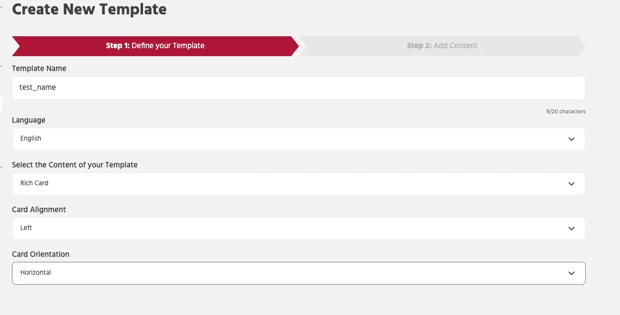
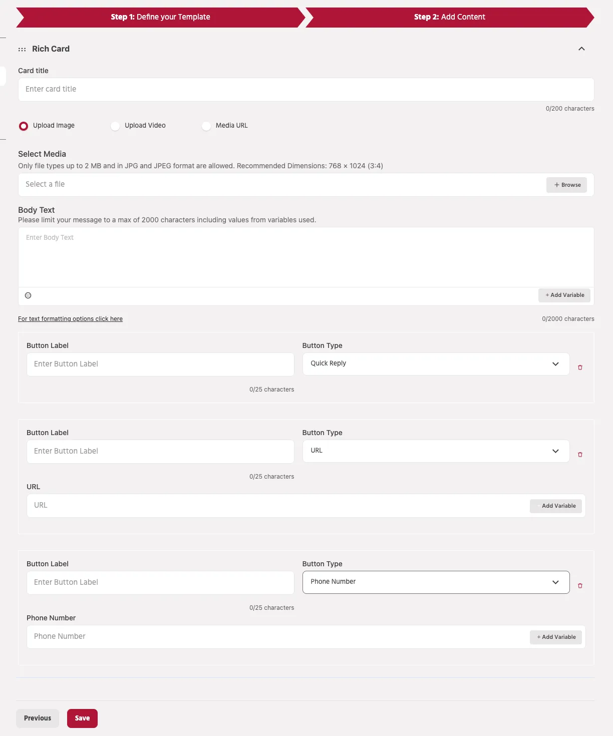
Components of a Horizontal Rich Card
A Horizontal Rich Card includes the following components:
- Card Title
- Media
- Body Text
- Buttons
These elements work together to deliver a visually engaging and interactive message.
Card Title
The Card Title is the main heading of the card that briefly describes the message content. It helps users quickly understand the purpose of the message.
Example:
Character limit
- Maximum 200 characters
Media
Media helps make the message more engaging by adding visual context to the content.
In a Horizontal Rich Card, the media is displayed on either the left or right side of the card, while the text content appears on the opposite side.
Supported media options include:
- Upload Image – Upload an image directly from your device.
- Upload Video – Upload a video file to enhance the visual presentation.
- Media URL – Provide a hosted media link if the media is stored externally.
Media Requirements (Horizontal Card)
To ensure proper display across supported RCS devices, the media should follow the recommended specifications.
Image Requirements
- Supported formats: JPG / JPEG
- Maximum file size: 2 MB
- Recommended dimensions: 768 × 1024 pixels
- Aspect ratio: 3:4
Following the recommended image dimensions helps maintain proper card layout and ensures the media displays correctly on supported devices.
Video Requirements
- Supported format: MP4
- Maximum file size after processing: 10 MB
Videos help enhance engagement but should remain within the supported size limits for optimal performance.
Media URL Requirements
If using a Media URL instead of uploading files:
- The URL must be publicly accessible
- It must point directly to the media file
- File size and format restrictions remain the same
Example:
Body Text
The Body Text contains the main message content displayed in the card. It can include additional information such as product details, offers, instructions, or announcements.
You can also include variables to personalize the message.
Example:
Body Text limits
- Maximum 2000 characters
- Character count includes values inserted through variables.
Buttons
Buttons allow users to interact with the message directly from the card.
Supported button types include:
Quick Reply
Sends a predefined response back to the bot and continues the conversation in the configured bot flow.
URL Button
Opens an external webpage when the button is clicked.
Example use cases:
- Visit a website
- View product details
- Access promotional offers
Phone Number Button
Allows users to directly call a phone number from the message.
Example use cases:
- Contact customer support
- Call a sales representative
- Request assistance
Best Practices
- Use high-quality media that follows the recommended dimensions.
- Keep the card title concise and clear.
- Use buttons to guide users toward meaningful actions.
- Ensure media files are optimized for faster loading.
- Test the card before sending it in broadcasts or campaigns.